
“I don’t get it. My clients love working with me. When I’m on a call or in a workshop, they get it. They sign up. Most of my clients come from referrals. I’ve even tried running ads, but my website still doesn’t convert.”
Do you also experience similar things? You’re not alone.
I hear this from coaches all the time. You know how to transform lives. Your clients rave about you and send referrals. The problem isn’t your coaching it’s that your website isn’t doing its job.
After working on 50+ websites for coaches and conscious brands, I’ve noticed a clear pattern: most don’t need more traffic. They need a site that actually converts the traffic they already have.
A coach with 3,000 monthly visitors but a weak site might see a 1% conversion rate that’s 30 signups. Another coach with 750 visitors and a strong, strategic website can hit 4% same 30 signups with a fraction of the traffic.
The gap between a website that limps along and one that fills your calendar isn’t magic. It’s fixable.
In this blog, I’ll break down what’s really stopping your website from converting and how to fix it without starting from scratch.
Part 1: Why Most Coaching Websites Don’t Convert
1. You’re Selling Coaching, Not Solving Problems
Your visitors aren’t looking for abstract empowerment. They’re lying awake, wondering why they can’t stop second-guessing every decision. They’re one bad week away from burnout.
Most coaching sites talk about the coach, their credentials, methods, and packages instead of them( your prospects) and what they’re struggling with.
Your certification matters, but not in your headline. What matters most is whether you understand the deeper emotions that your Ideal client experiences due to the problems they are facing.
The Fix: Speak to symptoms before solutions. Instead of “I help women step into their power,” try “I help burned-out corporate women stop people-pleasing and start setting boundaries that stick.”
See the difference. One is vague inspiration. The other is a mirror.
To write resonant copy, go three layers deep into your audience’s pain:
The reason your website copy feels off is that you’re not digging deep enough into your audience’s problems. You need to go three layers deep. Surface level: “I’m stressed.” One layer deeper: “I can’t say no to my boss.” Two layers: “I’m terrified people will think I’m difficult.” Three layers: “I don’t believe I deserve to have needs.”
2. Your Coaching Website Copy Sounds Like Everyone Else’s
Quick test: Go to three coaching websites in your niche. Copy their headlines. Can you tell whose is whose?
If the answer is no, you’ve got a differentiation problem.
Clichés like transform, empower, and elevate have lost all power. People aren’t looking for “transformation.” They’re looking to fix one specific pain that’s driving them crazy.
Generic language creates generic trust, which creates generic conversions. Which is to say: none.
The Fix: Use your audience’s actual words. Go through your testimonials. Read your DMs. Your ideal clients are handing you gold phrases like “I finally stopped overthinking everything” or “I can actually enjoy my success now.”
Those aren’t marketing phrases. They’re human phrases. Use these and see the conversions soar.
Because if your copywriting is all about yourself, why should readers care? This common copywriting mistake leaves a lot of conversions on the table..
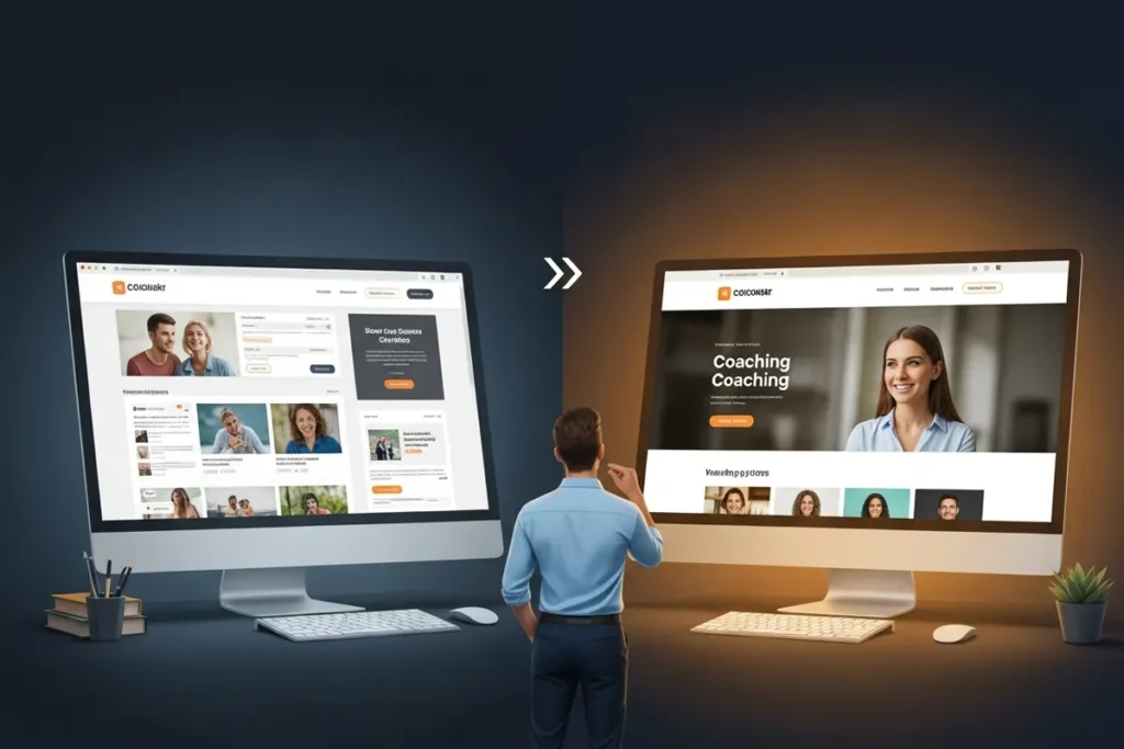
3. The Website Design Looks Pretty, But Doesn’t Convert
Aesthetics get likes, not clients.
I’ve seen beautiful websites with stunning photos, elegant fonts—and conversion rates under 1%. Because looking good and working well aren’t the same thing.
Most coaching sites overwhelm visitors with too many choices book a call, join a newsletter, download a freebie, follow on Instagram. Decision overload kills action
The Fix: Every section of your website should lead somewhere. Your hero section leads to a CTA button. Your about section leads to your services. Your services lead to a booking. There should be a pattern, a natural flow, a journey mapped out for your website visitors so that they themselves don’t have to fret about what to do next.
Stick to a single, prominent call-to-action in the top navigation menu as too many options can overwhelm visitors. Multiple CTAs throughout your page are fine, but they should all point to the same primary action.
4. Your Offer Is Confusing Visitors
“I offer 1:1 coaching, group programs, VIP days, a course, and workshops.”
Which one should I pick? What’s the difference? Where do I start?
Decision fatigue kills conversions. When you offer everything, you sell nothing because your visitor’s brain short-circuits trying to figure out what they actually need.
The Fix: Present one primary offer with a clear transformation and next step. You can mention other services exist, but your homepage should champion one path. “Most of my clients start with a 3-month 1:1 container. Book a call to see if it’s right for you.”
Remember: the goal of your website is to convert visitors to the next step of the funnel, not to have them immediately become coaching clients.
5. You’ve Not Built Enough Trust
Your website should answer this uncomfortable question: why should someone trust you?
Not “why are you qualified?”, you probably have the certifications. But why should this specific person, who found you five minutes ago, hand over their email or money?
75% of consumers admit they judge a company’s credibility based on its website design. And typos, broken links, and other mistakes quickly degrade credibility and communicate an overall lack of attention to detail.
But it goes deeper than avoiding mistakes. You need active proof.
The Fix: Layer small trust signals throughout your site:
- Testimonials with photos and specific results
- Screenshots or DMs
- Media mentions or podcasts
- Real photos (no stock life coaches smiling with coffee cups)
Example:
Weak: “She’s amazing!”
Strong: “I was skeptical, but within two months I set boundaries for the first time. Worth every penny.”
Proof beats praise.
6. You’re Talking to Everyone (and Reaching No One)
“I help anyone who wants to live their best life.”
So does everyone else.
When you try to speak to everyone, you connect with no one.
Your messaging gets watered down. Your visitor reads your homepage and thinks, “This could be for me… or literally anyone else.”
Writing for everyone instead of a specific ideal customer with specific problems, language patterns, and objections is a critical mistake.
The Fix: Speak directly to one type of client. Not “busy professionals”—”40-something women in leadership who look successful on paper but feel hollow inside.” Not “people who want confidence”—”high-achieving perfectionists who can execute for everyone except themselves.”
When you narrow your message, the right clients lean in and say, “She’s talking to me.
Part 2: How to Fix It (Without Blowing Your Budget or Starting Over)
1. Start with Website Strategy, Not Website Design
Most coaches get this backward. They redesign their website ,thinking it’ll fix conversions. Three months and $5,000 later, the new site is prettier—and converting exactly the same.
Why? The problem wasn’t the design. It was the strategy beneath it.
Before you change a single pixel, answer these:
- Who exactly is this website for? (One person. Not three segments.)
- What’s the ONE action you want them to take?
- What’s stopping them from taking that action right now? (Trust? Clarity? Objections?)
Companies spend just $1 on conversion rate optimization for every $92 spent on customer acquisition. Most coaches would see better ROI from optimizing what they have than driving more traffic to a broken site.
Create a simple funnel map: Awareness → Trust → Conversion. Then audit your site against it.
Use tools like Hotjar or Microsoft Clarity to see where people actually click, scroll, and leave. Data beats assumptions.
2. Rewrite Website for Clarity and Connection
Good copy doesn’t sound like marketing sounds like a friend who gets it.
Three Copy Upgrades That Convert:
Three quick upgrades:
- Use “you” more than “I.”
- Paint pictures, not platitudes.
Instead of “Get clarity,” try “Wake up to leads in your inbox instead of chasing them down.” - Make headlines outcome-driven.
“Life Coaching for Women” → “From Overwhelmed to Fully Booked in 90 D
The second headline tells a story. It implies a before state, an after state, and a timeline. That’s not a headline, it’s a promise with a specific timeline.
3. Design for the Scroll, Not Just the Wow
Studies show people read online in an F-pattern: most of line 1, half of line 2, then skim through the rest or bounce to the next paragraph..
Your website needs to work for skimmers.
Keep hero sections clean:
- One clear headline
- One short benefit statement
- One single CTA
No paragraph of text. No four different buttons. No popup asking for their email before they’ve read anything.
Add visual hierarchy:
- Use whitespace to let content breathe
- Make headlines bold and scannable
- Use buttons, not text links, for your main CTA
Mobile-first design: Mobile devices now account for over 60% of internet traffic. And 37.1% of web designers say the major reason visitors abandon a website is unresponsive design.
Your mobile experience isn’t optional. It’s where most of your traffic lives.
4. Build a Credibility Layer
Trust isn’t built with one element. It’s built with a layer of micro-proofs scattered throughout your site.
Add testimonials, mini case studies, and social proof stats like “100+ coaches served,” “$500K client revenue generated” etc. Sprinkle them throughout every key page.
5. Automate and Save Time
Your website should work for you, not create more work.
Integrate:
- Booking software (Calendly, Acuity) so people can schedule without email tennis
- Payment systems (Stripe, PayPal) so you collect money while you sleep
- Email automations that nurture leads without manual emails
Add an FAQ section that answers the questions you get 47 times a week. Create a clear services page so you don’t have to type it out in every DM.
This isn’t about being impersonal. It’s about respecting your time and your leads’ time.
Part 3: What a Converting Coaching Website Actually Looks Like
1. Clear Message (That Passes the 5-Second Test)
Your website header must answer key questions within five seconds: what you offer, who it’s for, and what action to take..
A visitor should immediately understand:
- Who you help: “Burned-out founders”
- What problem you solve: “Who can’t turn off their brain”
- What transformation you deliver: “Finally feel calm instead of constantly wired”
Example: Headline: “Stop Running on Stress and Start Running on Strategy”
Subheadline: “For high-performing founders who want to build 7-figure businesses without burning out”
CTA: “Book Your Clarity Call”
Five seconds. That’s all you get.
2. Simple Navigation = More Action
Meaningful navigation labels indicate that the company considers users’ needs and understands their mental models and vocabulary..
Your navigation should be intuitive:
- Home
- About
- Work With Me
- Results
- Book a Call
That’s it. If you need a dropdown menu, you probably have too many options.
One clear path to book or learn more. Fewer clicks, more clarity.
3. Copy That Sounds Like You (But Sells Like a Pro)
Your tone should be relatable, your stories clear, your persuasion subtle.
Bad: “I leverage transformative methodologies to facilitate breakthroughs.”
Good: “I help overthinkers get out of their head and into consistent action—without the toxic positivity.”
The second sounds more human. It’s specific. It acknowledges what doesn’t work.
The About page really isn’t about you; it should mainly be about your ideal client, as visitors don’t care where you went on vacation or your hobbies. They want to know how you serve your clients to get the results and why your process works, how you have tested it..
Remember, your story matter,s but only the parts that make you relatable and credible. They need to know: “Have you been where I am? Can you get me where I want to go?”
4. Strategic Design (That Guides, Not Distracts)
Design should direct the eye like a tour guide—no confusion, no dead ends.
- Scroll-stopping visuals that complement your message (not distract from it)
- Design that guides the eye straight to your CTA
- Consistent branding that builds familiarity
A well-crafted home page creates an emotional connection with potential clients, making them feel understood, valued, and inspired through a clear unique selling proposition..
Pretty is nice. Strategic is profitable.
Your Coaching Website Should Work Harder Than You Do
Your website can be your best salesperson or your biggest bottleneck.
Every visitor who leaves without acting is a missed opportunity—not because you’re not good enough, but because your site isn’t doing its job.
You don’t need more followers or funnels. You need a website that works even when you don’t.
One that builds trust before the call, turns visitors into leads, and sells while you sleep.
The coaches who thrive aren’t the loudest. They’re the clearest.
The difference between a 1% and 4% conversion rate isn’t luck, it’s strategy.
And that’s something you can fix.
That’s exactly what I build for my clients—all-in-one websites that look good, sound true, and convert with ease.