
Sarah checked her phone at 3:17 AM.
A new email notification glowed on the screen: “Contract Signed – New Client Onboarding.”
Someone had just enrolled in her $4,500 coaching program.
While she was asleep.
No sales call.
No discovery session.
No endless DMs.
Just a stranger who found her website, read her words, and clicked “Let’s Get Started.”
This isn’t luck.
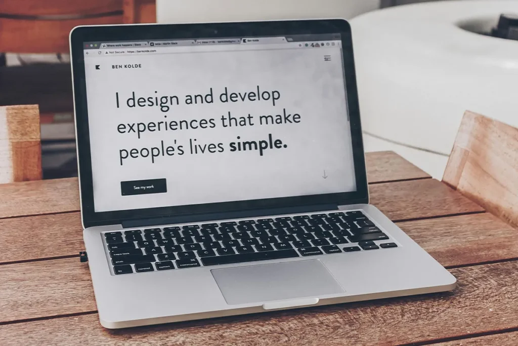
It’s what happens when your website is built to sell — quietly, confidently, and 24/7.
Most coaches, designers, and copywriters never reach this point.
They work 60+ hours a week, post consistently, get engagement, and even spark interest…
But when those curious leads finally land on their website, the trail goes cold.
The truth is, people don’t leave because your services aren’t good.
They leave because your website doesn’t give them a reason to stay.
Let me share a few stats to make my point.
According to research, 50% of prospects make a buying decision after exploring a website, and 68% of small businesses don’t have a proper conversion strategy.
Another study carried out at Stanford found that 75% of people judge a brand’s credibility by its website’s design and clarity.
This means many businesses are sleeping on easy money. Just by not prioritizing their websites, they are leaking a lot of profits that they can make.
This is one of the reasons why you shouldn’t treat your website as an online brochure. Consider rit as your 24/7 sales person. Invest in it and you’ll see the ROI is far more than your expectations.
After working on 50+ website copy projects over the past four years, I’ve seen one clear pattern.
The difference between a site that sits idle and one that books clients overnight comes down to three ingredients:
Copy that converts.
Design that builds trust.
Tech that runs smoothly.
Ingredient #1: Copy That Converts (Copywriting That Sells For You)
When someone lands on your homepage, you’ve got seconds to answer one question:
“Is this for me?”
According to eye-tracking research, visitors take 2.6 seconds to find the key area that shapes their perception. If you don’t grab attention fast, 79% of people will click away and look for another provider.
That means the words on your website can make or break the deal.
Your copy is your silent salesperson. It works around the clock — answering objections, building trust, and guiding visitors toward a “yes” while you’re asleep.
The problem? Most service providers spend thousands on design but forget to make the website actually sell.
Their copy talks about features, while visitors care about results.
It’s packed with industry jargon, when people just want simple, human words that reflect their struggles and hopes.
If you want visitors to sign up, you have to make them feel understood.
And that only happens when your words sound real, clear, empathetic, and rooted in their desires and fears. Show them how your service changes their story, not just their to-do list.
Whenever I’m on a strategy call with a prospect, I walk them through a quick exercise that always opens their eyes. I call it 7-Second Clarity Test

The 7-Second Clarity Test
Pull up your homepage right now. Show it to someone who’s never seen your brand before for exactly 7 seconds.. Then ask:
- What does this business do?
- Who is it for?
- Why should they care?
If they can’t answer all three, your copy is costing you clients every single day.
Headlines That Promise Transformation
Your headline isn’t about you.
It’s about the change you create or the problem you solve.
I use this 5-Part Value Proposition Formula to write scroll-stopping headlines for my clients. Steal it and use it for your own site—you’ll see the difference fast.
The 5-Part Value Proposition Formula
Every high-converting headline should answer at least 3 of these within three seconds:
FOR WHOM (Target Audience)
 “I help busy people achieve goals”
 “I help burnt-out corporate executives escape the 9-5 grind”
WHAT (Core Offering)
- “Premium coaching services”
- “90-day career transition program”
WHY (Problem You Solve)
- “Increase your business Revenue”
- “Stop trading time for money while working 70-hour weeks”
HOW (Unique Method)
- “Using proven strategies”
- “Using the Freedom Framework™—tested with 200+ entrepreneurs”
UNLIKE (Differentiator)
- “We’re the best in town”
- “We specialize exclusively in helping service-based solopreneurs.”
You can cover three of these points in your main headline and the remaining two in the subhead. The goal is instant clarity—so visitors know who you help, how you help, and why it matters at a glance.
When people immediately think, “This is for me, this is what happens, this is what to do next,” you’ve cleared their first hurdle toward conversion.
Use simple, human language. Drop the buzzwords. Jargon and confusing technical terms create friction. Clarity, specificity, and relatability are the three pillars of a website copy that turns visitors into buyers.
Once your headline and subheads nail the promise, it’s time to back them up with proof.
Proof Builds Trust

Every bold claim needs evidence, because anyone can claim results. Few can back them up with specifics.
Your prospects are skeptical for a reason: they’ve seen too many vague promises. The right proof elements silence doubts before they’re even voiced.
Do you know 92% of consumers read testimonials before buying, and 88% trust them as much as personal recommendations. And adding testimonials to your website can boost conversions by 58% and increase revenue per visitor by 62%.
Here‘s a powerful testimonial structure that instantly makes you look legit.:
[Starting point] + [Specific results with numbers] + [Timeframe] + [Emotional transformation] + [Full name, photo, location]
Example:
“Before Jennifer’s program, I was stuck at $3K months and working 60-hour weeks. Within 90 days, I hit my first $15K month while cutting my hours in half. I finally have the freedom I started this business for.”
— Marcus Rivera, Business Coach, Denver CO
Notice how it’s not fluffy. It’s measurable, emotional, and real.
The goal isn’t to impress. It’s to build trust. When visitors see people like them winning through your service, your credibility skyrockets.
Strategic Copy Placement
Strong copy isn’t just about what you say, it’s about where you say it.
Even the best-written words lose power if they’re buried in the wrong place.
Your website should guide visitors through a clear psychological and logical journey, from curiosity to confidence to conversion. Every section has a job to do.
Above the Fold:
This is prime real estate. You’ve got seconds to grab attention.
- Clear headline that promises transformation
- Sub-headline that defines who it’s for and what they gain
- One strong call-to-action (CTA) that moves them forward
Mid-Page:
Now that they’re interested, build trust and clarity.
- Explain your unique process in 3–5 simple steps
- Add proofs like testimonials, case studies, client results
- Address common objections (“What if this doesn’t work for me?”)
Bottom of the Page:
End with conviction and reassurance.
- Repeat your main CTA, now with urgency or a guarantee
- Include an FAQ section to remove final doubts
When done right, your copy feels effortless to read. It gently answers unspoken questions and leads visitors to act without feeling sold to.
Real Transformation
A carer coach reached out for help with her website. She had a sleek site with zero engagement. Her headline read: “Helping professionals unlock their true potential and high-paying roles.”
Nice but vague. Unmemorable. Converting at 0.3%.
Rewrote the headline to be more specific and relevant: “I help career-driven women build confidence and land the roles they deserve without burnout.”
Along with the head and subhead, team added three testimonials right below the hero section to make a stronger impact, and it worked out.
Result: 2× more discovery calls in three weeks, same traffic.
Ingredient #2: Design That Builds Trust (High-Converting Website Design)
Your website visitors form opinions in 50 milliseconds. About 64% of those impressions come from design.
You can have the most persuasive copy in the world, but if your layout looks clunky or chaotic, people bounce
Stanford’s Web Credibility Project found that people rely far more on visual cues than words when deciding if a website is trustworthy. In short, your design either builds confidence instantly or destroys it just as fast.
When your copy and design work together, visitors can move through your site easily, find what they need, and feel reassured enough to buy. Most people miss this—they confuse “good design” with trendy animations or fancy effects. In truth, good design is about clarity, credibility, and smooth navigation.
That’s why the highest-converting websites usually follow a clean, minimal layout. Nothing noisy. Nothing unnecessary. Just focus, flow, and trust.
The Trust-Building Design Framework
- Clean, Uncluttered Layout
Whitespace isn’t wasted space; it’s breathing room that guides attention.
✓ One clear message per section
✓ Generous margins and line spacing
✓ Strategic use of color to highlight CTAs
✓ Remove anything that doesn’t serve conversion
- Mobile-First Responsiveness
Over 60% of web traffic comes from mobile devices. If your site doesn’t work flawlessly on phones, you’re losing the majority of potential clients.
✓ Thumb-friendly buttons (minimum 44×44 pixels)
✓ Readable text without zooming (16px minimum)
✓ Fast load times (under 3 seconds)
✓ Simplified navigation for small screens
32% of customers leave a brand they loved after just one bad experience. An unpleasant mobile experience is often that bad experience.
- Strategic Visual Hierarchy
Your design should guide eyes exactly where you want them to go:
Headline → Sub-headline → CTA → Proof → Body text
Make it effortless for the eye to know what matters next.
- Headline: Largest, boldest text
- Sub-headline: Secondary size, explains headline
- CTAs: High-contrast color buttons that pop
- Proof elements: Photos, logos, testimonials strategically placed
- Body copy: Easily scannable with short paragraphs
- Brand-Aligned Aesthetics
Your design should match your brand tone:
- Corporate consultant→ Clean, professional, sophisticated
- Business coach→ Bold, colorful, energetic
- Wellness practitioner→ Calm, organic, soothing
Consistency builds subconscious trust. Mismatched design elements create confusion and skepticism.
Trust Signals That Increase Conversion Rate
Professional Photography
Use real client photos, not stock images. Audiences spot fakes instantly, and credibility collapses.
Before/After Visual Proof
Add tangible results e.g: design transformations, dashboards, or screenshots with timeframes. Context makes proof believable.
Client Logos & Social Proof
Display 6–12 recognized brands you’ve worked with. 72% of consumers say positive reviews directly increase trust.
Video Integration
Landing pages with short videos can boost conversions by up to 80%. Keep them under 90 seconds and show real faces,real emotions, real results.
Strategic CTA Design & Text
90% of website viewers read CTAs, but design determines whether they click.
CTA button essentials:
The most important aspect of designing your CTA is the color. It should be prominent and stand out from the rest of the elements on the page.
✓ High-contrast colors (if your site is blue, use orange/red buttons)
✓ Large enough to notice but not overwhelming
✓ Surrounded by whitespace
✓ Copy limited to 3-6 words
✓ Placed high on the page, removing the need to scroll, significantly increases conversions
Example:
A designer with a gorgeous portfolio was struggling to land premium clients. Her site was beautiful, but generic. Testimonials were buried on a separate page.
A few small tweaks flipped the game for her. Adding a results section just below her core offer. The results section included 3 best case studies, a video testimonial, and a CTA at the end. Result: Her average project value rose 25% in 2 months
Bonus tip: Place your strongest proof near action points. When visitors see you’re credible, just as you invite them to act, hesitation vanishes.
Ingredient #3: Tech That Works Seamlessly (Website Automation and UX Optimization)
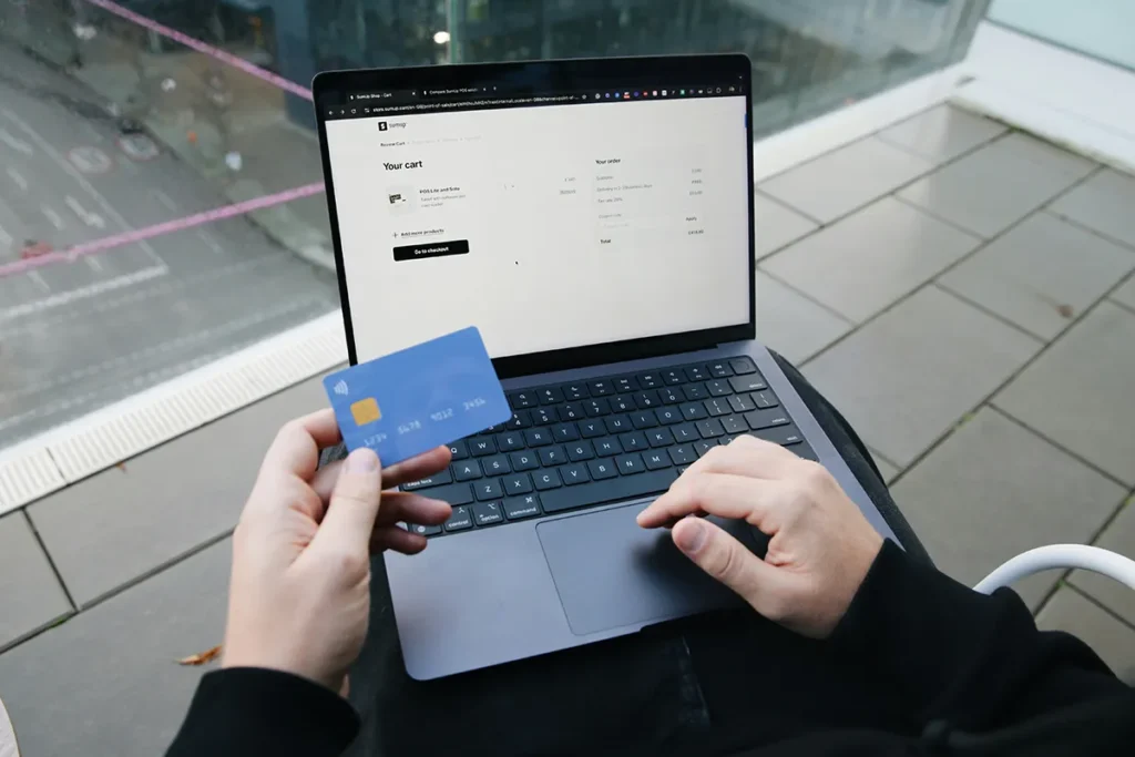
Imagine a high-paying client clicks “Buy Now.” The payment link freezes. They try again, once, maybe twice. Then they leave and probably buy from your competitor.
Broken forms, slow pages, or missing integrations quietly kill sales every day. Even the best copy and design can’t save a clunky website.
If your site isn’t reliable, fast, and fully connected, it’s like building a beautiful store on a weak foundation. You can’t scale what doesn’t run smoothly.
The Fatal Tech Mistakes
- Broken or Confusing Forms
If someone can’t book a call because your form throws an error, they’re gone for good. - Slow Load Times
Users form design opinions in 50 milliseconds, but they’ll bounce off instantly if your site drags. - Missing Automation
Manual follow-ups mean missed leads. When your systems auto-send confirmations, reminders, and links, you free time and prevent lost sales. - Mobile Dysfunction
If your site works on desktop but breaks on mobile, you’ve lost 60% of your audience before they even see your offer.
One broken link can cost thousands in lost revenue.
Example
One mindset coach had leads dropping off because her booking process was manual. Adding an integrated calendar, along with automated emails and a pre-call questionnaire, not only freed her time but improved her revenue as well..
Result: Book calls rose 30% within a month.
Why UX Optimization Pays Off
User experience is the backbone of website performance. Every dollar invested in UX brings about $100 in return, and strong UX can lift conversions by up to 400%.
When copy, design, and tech work in harmony not as separate parts, but as one integrated system, your website becomes your most efficient employee.

Turn Your Website Into a Conversion Machine
Sarah’s 3 AM email wasn’t luck. It’s happened again and again with different clients, different offers, the same pattern every time:
- Copy that speaks to pain and promises transformation
- Design that builds instant credibility and guides action
- Tech that makes conversion effortless and automated
That can be your reality too.
Your website isn’t a digital business card. It’s an asset that should attract, nurture, and convert while you sleep, travel, or spend time with family.
Ask yourself:
- Does your copy promise transformation or list features?
- Does your design build trust or create confusion?
- Does your tech work flawlessly or cause friction?
If you paused on any of these, that’s your cue to act.
Start by reviewing your website through this lens copy, design, and tech. Then decide whether it’s time to turn it into the conversion machine it was meant to be.
Your next client might be one click away. Make sure your website is ready when they find you.
Ready to turn your website into a client magnet?
Book a strategy session with me and let’s make it happen.